2020 Radar Chart Baseball Cards


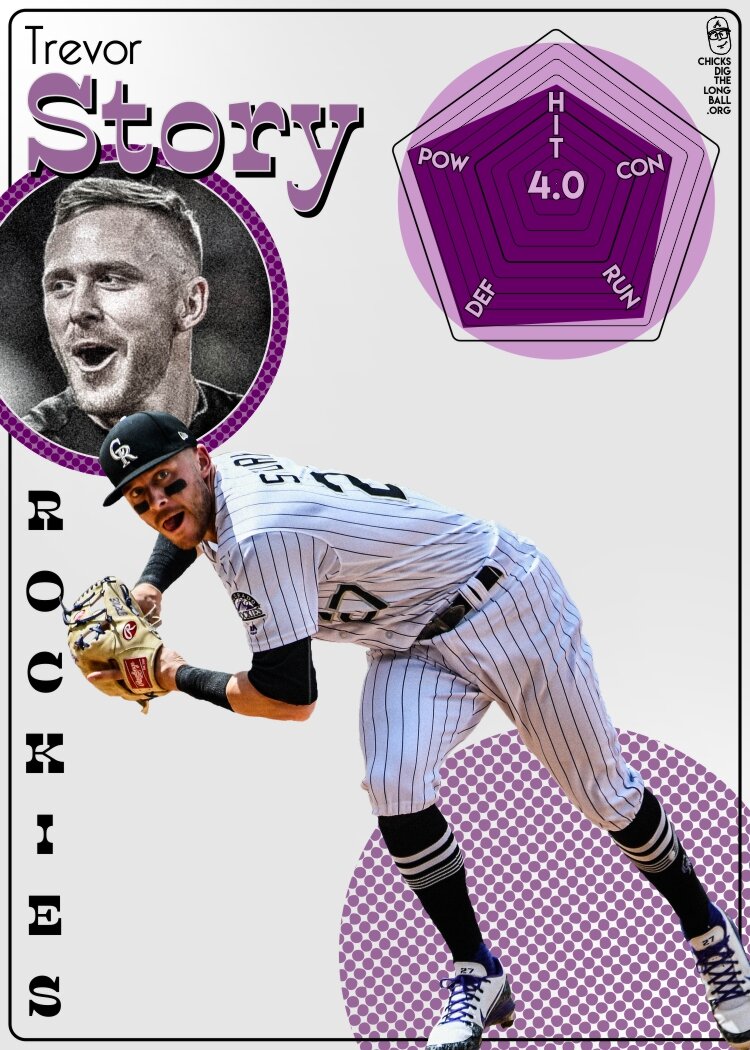
Radar Chart Cards show a player’s Percentile Rank in each of five different Baseball skills over the last three seasons
**downloadable cards at the bottom of page. Enjoy!
If you’re familiar with my cards from last season the actual radar charts should look basically the same to you. It’s still a three year sample size, with the same stat categories and the chart still represents a player’s percentile rank in each of the categories, while the lines are at 10% intervals. The one change on the Radar Chart that you will notice is the big number in the middle. That number is the player’s WAR(wins above replacement) Per 600 Plate Appearances.

Ketel Marte’s Radar Chart
The New Stat - WAR/600
I wanted to give a bit more context to the radar chart and I liked the idea of an all encompassing number to give more meaning to the shape of a player’s chart. WAR is the obvious solution here as it is an advanced metric that pulls together from much of the skills we are already using in the chart. You can read more about WAR here, but the quick shorthand for what a good or bad WAR total is: 0-2(bench player/scrub), 2-4(solid to good starter), 4-6(All-star/Stud), 6-10(MVP Caliber), >10(alien).
As for why I’m using WAR per 600 rather than just taking their WAR total and dividing it by three; 600 is often used as a big round number to represent a typical amount of Plate Appearances a player can have over a full season. Obviously players can get more or less depending on the team they are on and how often they get days off but it’s a good way to remove the playing time variable. Looking at Byron Buxton can help explain why. Buxton has had a couple big injuries so far in his career but when he’s been on the field he’s been a really solid player, hence his 3.9 WAR/600 while only having 2 WAR per season. Since I’m trying to look at the actual skills a player has I would rather put everyone on the same level as far as playing time.
So essentially, This number in the center of the chart shows us how valuable each player would be over one season, using their value gathered from a three year sample size.
The Returning Stats
A quick refresher on the stats used to make up the five categories of player skill.
POWER: ISOLATED SLUGGING
A simple stat that does a great job of showing the amount of power a player has. Isolated Slugging focuses only on hits that go for extra bases(doubles, triples, homers) by subtracting a players batting average from their slugging percentage.
HITTING: WEIGHTED RUNS CREATED PLUS
wRC+ factors in every single type of batting outcome, including walks, and even takes into account the park and league a player plays in. This stat can even be compared across generations because it takes into account the overall run environment of the season. It’s the best single tool to gauge hitting. fangraphs’ explanation
CONTACT: BATTING AVERAGE
An obvious choice to represent the Contact tool. Batting average, while not without it’s flaws, is a good component to a bigger picture as it shows a player’s ability to make quality and consistent contact. Calculated by taking total hits divided by at bats.
BASE RUNNING: BASE RUNNING RUNS ABOVE AVERAGE
This advanced metric calculates a whole lot of things that players do on the bases and jams it all together into one number. Top-end speed is crucial for a good BsR but there are obviously other skills like reads, instincts and acceleration that this stat tries to value. fangraphs’ explanation
DEFENSE: DEFENSIVE RUNS ABOVE AVERAGE
Finally, we have another all-encompassing metric. This is the best way to judge a player’s defensive skills if you want to look at just one number. The beauty of this metric is that it includes a positional adjustment making it possible to compare a Shortstop with a First Basemen, which is exactly what I need for this exercise. fangraphs’ explanation
The Player Pool
With the help of Fangraphs.com and Google Sheet I downloaded stats for all players that accumulated at least 900 Plate Appearances over the last three years. This years player pool totals 263 players(much more than fits on the image below). I kept the three year span of time just like last years cards because I like that it doesn’t put too much weight on one great year. You may notice that 900 Plate Appearances is much lower than a player would expect to get over 3 full seasons and that’s true. I have the plate appearance threshold lower to make the player pool bigger and include some players that don’t have 3 years experience yet(Acuna, Soto). Because I chose stats that are less dependent on playing time accumulation(Isolated Power Rate rather than total Home Runs, for example) it makes it easier to compare two players even if they have a 1000 Plate Appearance difference between them. Having said that, it’s still not a perfect experiment. An advanced metric like the Defensive Component is still benefited by having more playing time because a truly elite performer will have more opportunities to separate himself in the player pool.
Using a Percentile Rank Function I was quickly able to show where each player ranks among the entire player pool in that specific category(see image below). A player with a Percentile Rank of 1.00, like Trout in “Power,” means they have the highest Isolated Slugging in the player pool(or are a 99th Percentile performer in that stat).
Once I applied this function to each player’s stats my information was ready to insert into my designs. Below you’ll see a screenshot of how all of this looked in the player pool.

Slice of Google Sheet with stats used for Radar Charts
Cheat Sheet
I’ve made a quick reference guide that gives some quick details to help make sense of the card. This can be helpful for people to get a better sense of what these cards mean but I also believe that if you handed someone a bunch of these cards without all this extra knowledge they would still get a sense of how these cards work and what player’s are good at what. My goal was to make a card that intuitively and artfully gives you info about a player but that also has a deeper well of info and meaning for those interested in learning more.

The 15 Cards
As far as the players I chose to make cards for, there is little rhyme or reason. I mostly wanted to make cards for players I didn’t make cards for last year(Trout being the lone exception because I’m in love with him). I really like having a diversity of skill set in the group. Buxton and Conforto having vastly different looking charts that both come out to 3.9 WAR/600 is beautiful to me. Finally, from a design sense finding photos that are interesting to edit and team colors that are unique made me more likely to choose a player. Ketel Marte and Manny Machado both bring some strong color variety among the sea of Red and Navy that is Major League Baseball.
For the design this year I wanted things to be simplistic with a retro feel. I used softer color palettes when possible to highlight the action photo better. I added a headshot for each player to try to bring more of their personality to the cards. I decided to have each player fully cut-out, unlike last year, simply because I wanted to improve that skill of mine. It also allows more of the focus to be on the actual radar chart without the distraction of the image background. All together each card probably took about 2 hours each. Much of that time spent cutting out and editing the main photo.